Skip to content
brand, identity, and logo design

The Midnight Society

about the brand design

a group of YA horror writers

The Midnight Society is an online magazine publishing articles that cater to writers in the middle grade and young adult horror and dark fiction genres. Inspired by Are you Afraid of the Dark?, the group discusses everything spooky from pop culture to trends in books.

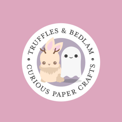
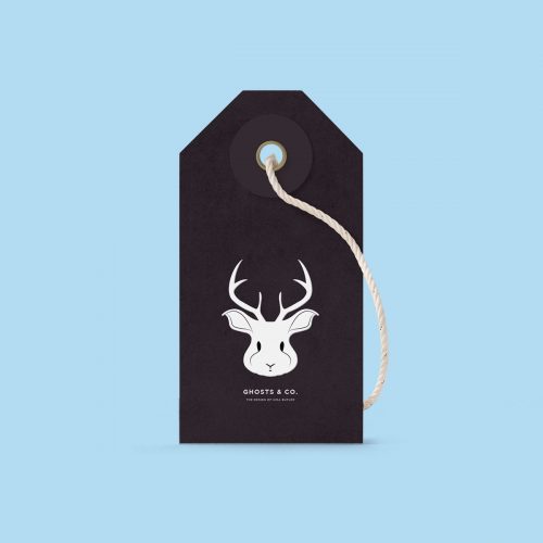
The logotype is set in a flourished serif with custom illustrations to complement the negative spaces found within the typeface. The design’s approach was to achieve something elegant and spooky, with classic iconography reminiscent of Halloween horror tropes: a black cat, a cloud of bats, and a raven.

The brand’s color palette is also a nod to haunted houses of a Victorian persuasion, but with a younger, energized feel: twilight purples and black are offset with bright pink highlights. The text is often rendered in white, pink, or ghostly grey over darker tones to improve legibility.

Patterns used on the website and in social media recall wallpaper from Victorian haunted houses. The palette has been exaggerated to suit the younger audience for the website: teenagers interested in horror fiction. The design is friendlier than its adult counterpart might be rendered.

0
years active
0
contrbutors
0
logo design
0
integration
from our portfolio

similar brand design projects