The Witch of Laurel Wood

Brand, Identity, and Logo Design
About the Brand Design

mystery, magic, and growth

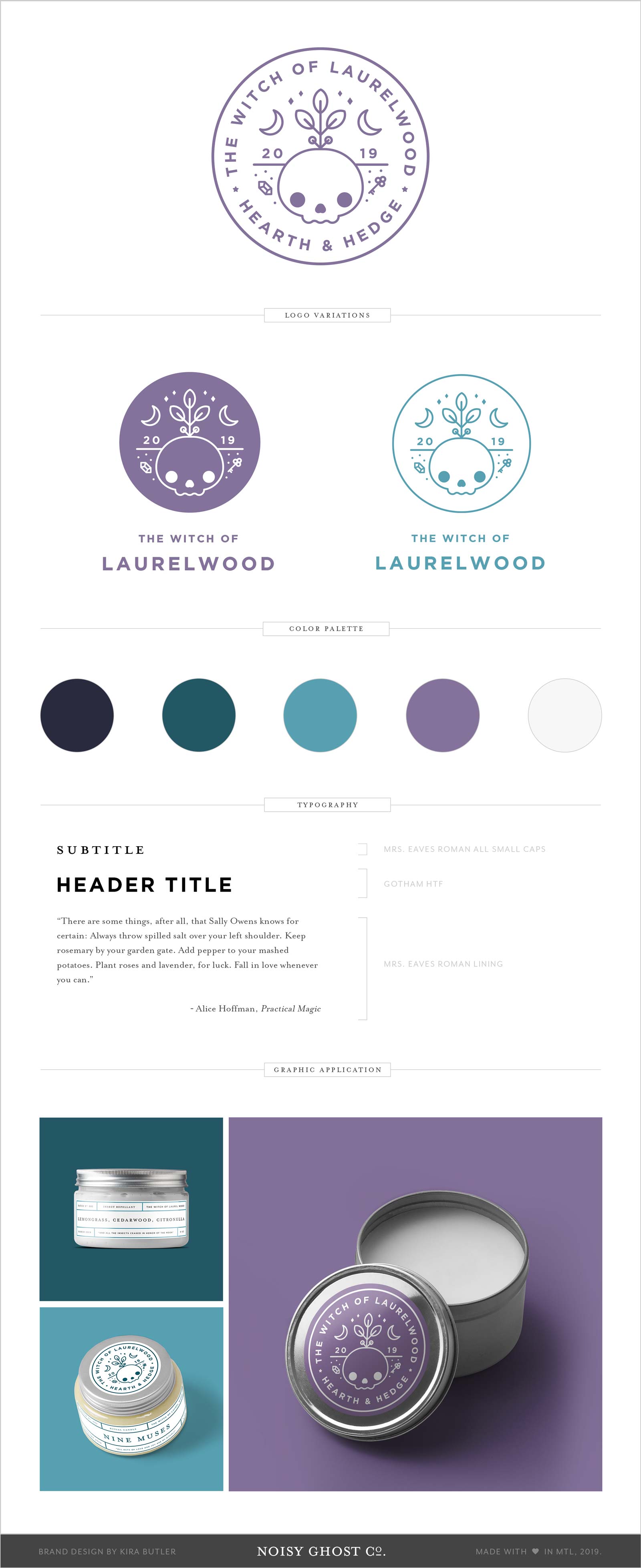
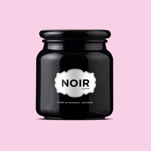
A brand designed around the concept of rebirth, magic, mystery, and darkness that nevertheless embraces its pagan roots — literally. Belonging to a kitchen witch, iconography for the brand is drawn from the hermetic aphorism, “As above, so below,” and references the elements of earth and air, and a balance between them.

The Witch of Laurel Wood

A contemporary take on kitchen witchcraft required clean lines, but a throwback to the roots and bones that anchor the practice at the hearth. Products in the line include naturally-sourced candles and cosmetics, and the brand meditates on its magical roots and natural connections.

The design is inspired by the phrase “As Above, So Below,” from a passage in the Emerald Tablet (attributed to Hermes Trismegistus.) In Hermeticism, the phrase can be taken to indicate that earthly matters reflect the operation of the astral plane.

We provided a few logo and logotype variants that make use of the brand mark, and created a selection of simple, airy product labels to complement the design that could be easily updated and adapted for a variety of packaging sizes, regardless of the package contents.

Noisy Ghost Books Brand Design

Noisy Ghost Books Brand Design

The Noisy Ghost Books brand mark blends a love of reading (and a favourite place to do it — an antique armchair) as well as a subtle reference to poltergeist activity. Small shadows beneath the chair legs indicate that something is levitating the furniture.

Ghosts & Co. Brand Design

Ghosts & Co. Brand Design

An unusual approach to design warrants an unusual logo. The brand mark for Ghosts & Co. is a jackalope — a cryptid that has a particular personality. We christened him “Truffles.” Not just an ordinary bunny rabbit, the Ghost & Co. brand mascot has antlers.

Tooth & Bone Brand Design

Tooth & Bone Brand Design

The Tooth & Bone brand is as much an assembly of items as the collection of oddities the blog houses. It recalls the practices of collection and display from the Enlightenment, largely because the content curated by the T&B blog is similarly themed.

Lightness Brand Design

Lightness Brand Design

The Lightness brand design incorporates a candle flame into the logo. Typography is clean and minimalistic to suit an uncluttered space.

Noisy Ghost Co. Brand Design

Noisy Ghost Co. Brand Design

Noisy Ghost Co. is a macabre but affectionate brand. It’s sugar skulls and ice cream, coffins and candy: a red sock accidentally mixed in with the laundry, turning its emblematic death-shroud-sheet… pink. It is the spirit of design that remains curious, inquisitive, and explorative…

The Midnight Society Brand Design

The Midnight Society Brand Design

The Midnight Society is an online magazine publishing articles that cater to writers in the middle grade and young adult horror and dark fiction genres. Inspired by Are you Afraid of the Dark?, the group discusses everything spooky from pop culture to trends in books.

Villainess Soaps Brand and Identity Design

Villainess Soaps Brand and Identity Design

The Villainess Soaps brand seeks to “redefine bad” — it’s a rose with thorns, beautiful but sharp. We designed with nod to the drama and romanticism of the Victorian era: flourishes, rich jewel tones, floral gestures edged with a little darkness.

Related Projects
Summon Us

We're not around right now. But you can send us an email and we'll get back to you, asap.

Not readable? Change text. captcha txt

Start typing and press Enter to search

Noisy Ghost Co. Brand Design