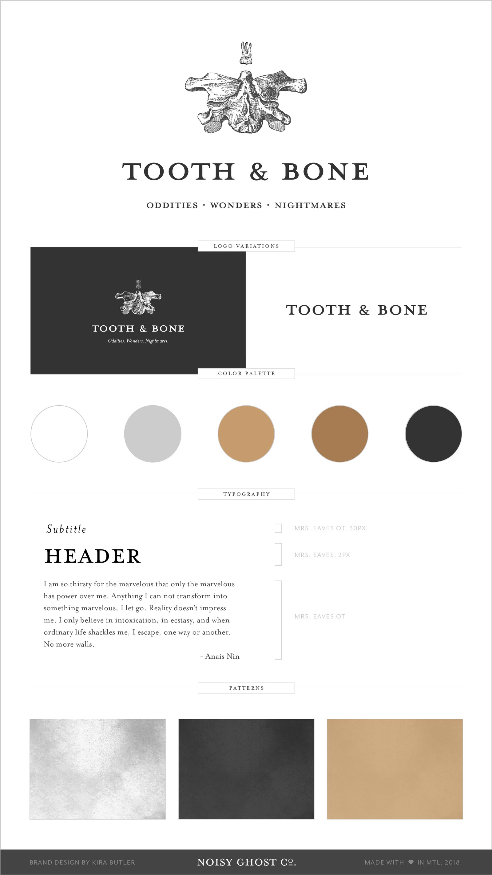
The Tooth & Bone brand is as much an assembly of items as the collection of oddities the blog houses. It recalls the practices of collection and display from the Enlightenment, largely because the content curated by the T&B blog is similarly themed.
The brand’s logo design is taken quite literally: a pelvic bone crowned with a molar, and set with Emigre’s Mrs. Eaves petite caps.
Brand colors recall golds and coppers, paper textures, and old photographs. Deep grey and white offset the warmer tones.