Skip to content
brand, identity, and logo design

Villainess Soaps Brand

about the brand design

victorian in spirit

The Villainess Soaps line of products is expansive. After working together for ten years, Brooke Stant and I have amassed a collection of designs that demonstrate an expaansive catalog of products, limited editions, wholesale products, and special commissions for third-party resellers. No two product labels are exactly alike. Inspired by a vintage collection of Victorian shopping catalogs, the aesthetic makes use of grainy typeset typography, luscious leather patterns, and period-specific illustrations scanned directly from vintage catalogs.

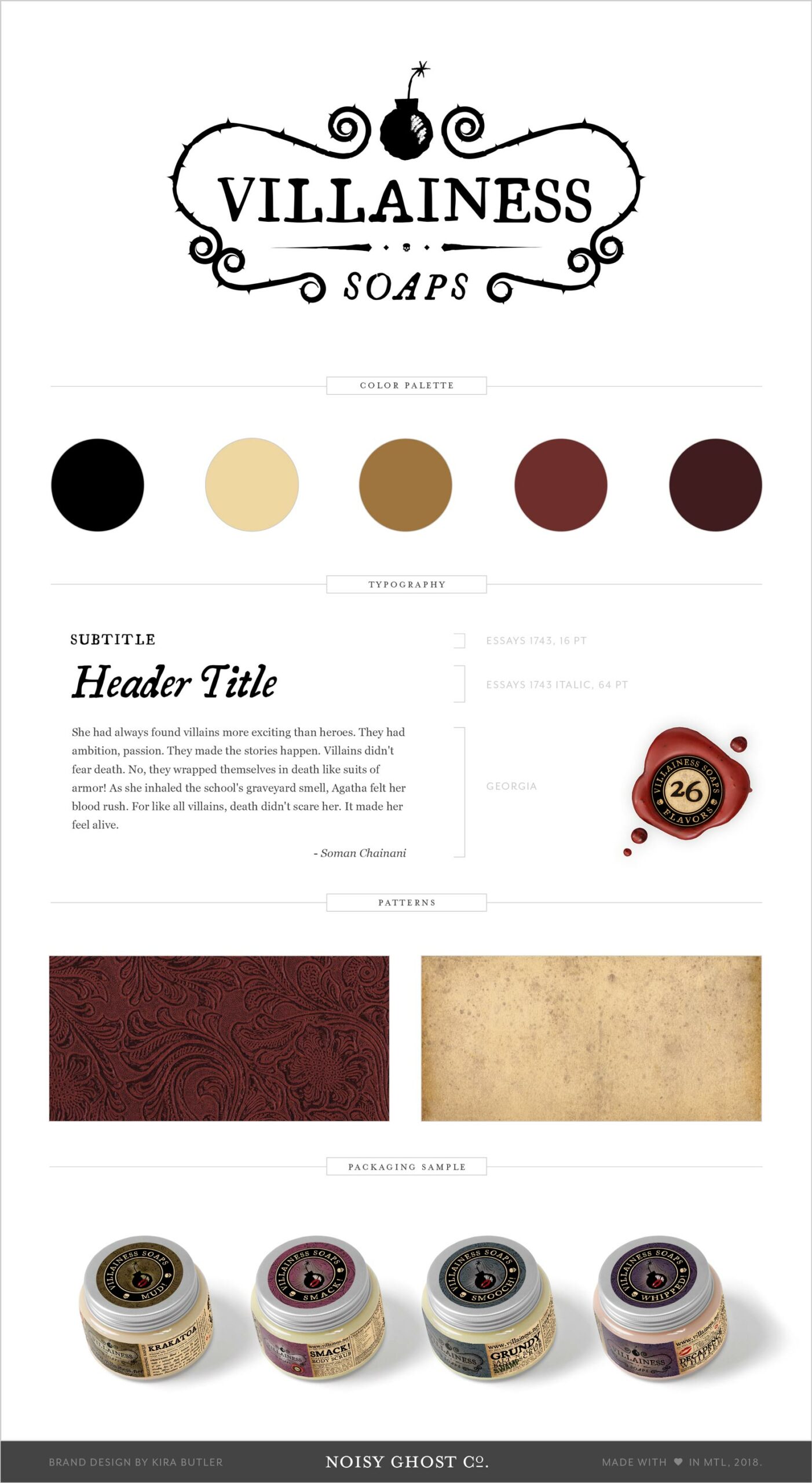
The color palette for the Villainess Soaps brand is rooted in jewel tones. We needed to anchor the various product families with their own color scheme beyond the primary brand, so while the burgundy and paper tones act as a jumping off point, we paired product families with their own respective palettes: blue, green, sepia, and pink.

We also solved the limited edition branding problem by eliminating most color and reducing the palette to shades: black, white, and silver. Only a pop of color remains within the “kiss” element — a hint of red to add visual interest. The leather textures of this line were likewise desaturated to dark grey with minimal highlights.

Co-branded products beneath the Villainess Soaps umbrella like the Black Phoenix Trading Post collection preserves several nods to the primary brand: textured and photographic scans of paper, but also the artwork used to recall the collaboration. There is a hint of Villainess flavor in collaborative products to maintain visual cohesion.

0
product labels
0
years of collaboration
0
limited collections
0
wholesaler variations
from our portfolio

similar branding projects