Graphic Design for Horror Writers
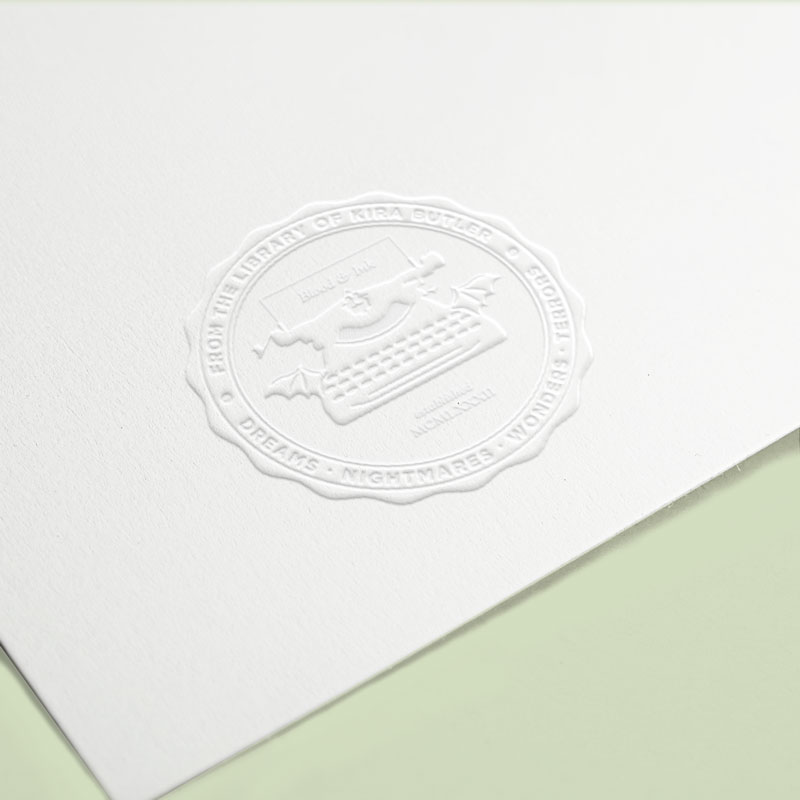
Horror Writer's Embosser Seal
About the Design and Brand Mark
ex libris
Using the brand mark for horror writer, Kira Butler, the seal adapts the vintage 1920 Corona typewriter and baby batwings as an integrated logo into the design. The seal’s design was inspired by embosser stamps used to imprint library books, and has been used in multiple applications for stationery.
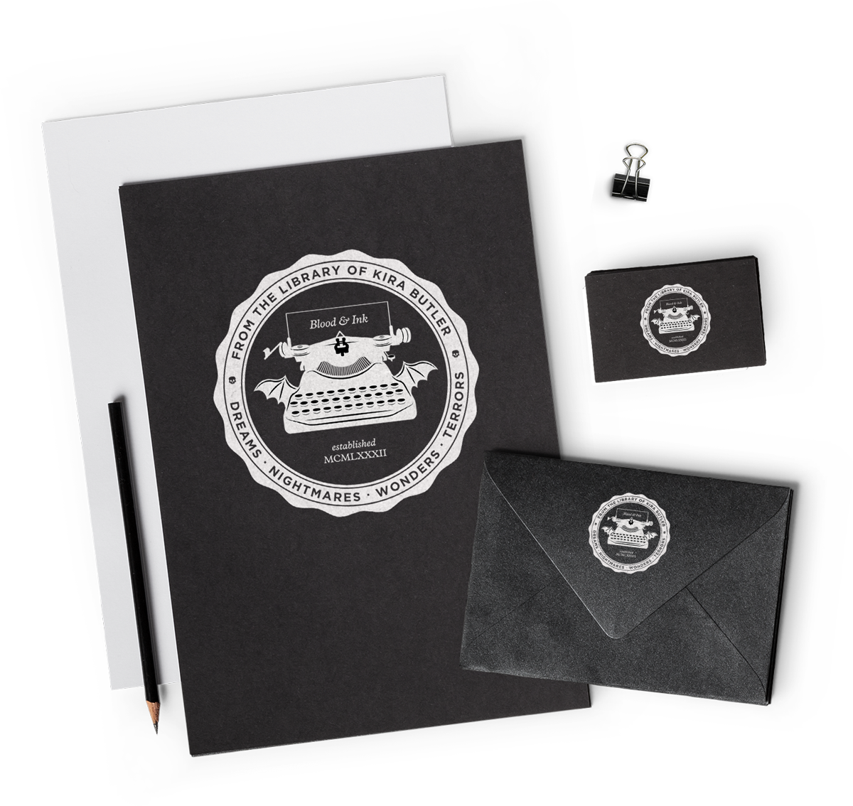
Graphic Design Applications in Various Contexts
a collection of mockups


Kira is very systematic in her approach to design. In my experience, she is the designer that managed to make her art the most objective -- by that I mean that all of her choice are reasoned and justified and don't come under the umbrella of simple taste. Hard working and serious, Kira is also fun [and] got along very well with her colleagues. Finally, she doubles her UI/UX skills with that of an independent writer. This is simply further proof of how hard-working, disciplined and dedicated Kira can be. Not to mention creative. I would work with Kira again in a heartbeat.
David TemanSenior Director, Digital Experience at Luxury Retreats
As an interactive publishing company, Ackerly Green often has some pretty out there graphic and illustrative demands. We might need designs for fantasy book-related merchandise one week, and the haunting sigil of a secret society the next. No matter what we need, Noisy Ghost has met every challenge we throw at her with out of the box ideas, stellar communication, and perfect final products that we’re always proud to show off. Her years of experience and razor sharp creative eye make for a killer combination.
CJ BernsteinAckerly Green Publishing
Kira, you killed it! Honestly, I came to you without a brand, a plan, or any clue of how to put them together into a functional website. However, by the time we finished I had all of those, and more importantly, the confidence to unveil my amazing, beautiful, and compelling site to the world. Thank you for making ‘Tales of Weird Florida’ far more than I ever imagined it could be. You will always have a grateful fan in the “Strange Shine State!”
Martin ShannonUrban Fantasy Author
In the span of six months, Kira materialized a relatively abstract list of requirement into UX mock-ups (including interactive prototypes). Each time, her part of the work was conducted faster than our product management ideation (and we're no slouch either). Her design decisions were clearly explained to our development team and helped guide their work. Pragmatic, straight to the point and right on the money - I'd work with her again anytime!
Jean-Francois YelleProduct Director at Wirkn
As a design client, I have been thrilled to work with someone who can translate my vague ideas into a viable format, but I have been even more impressed by Kira's professionalism. From the initial project contract and timeline, to the detailed invoices and realistic deadlines, I always know exactly where we stand in terms of project completion - an invaluable assurance. Working with someone this reliable and talented has been a pleasure I hope to repeat.
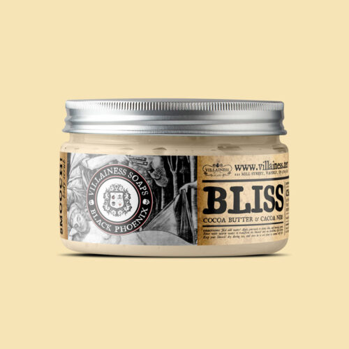
Brooke StantVillainess Soaps
Kira Butler far exceeded my expectations on many levels. She is an amazingly talented web designer who knows how to execute her vision from beginning to end, as well as interpret my own into a design that can work. And what also impresses me is the way she conducts herself with such a high level of professionalism and integrity. I have hired her for other projects besides my web site design, and would not hesitate to do so again, I also recommend her every chance I get to others in need of similar services.
Lisa FarrellMoonaLisa
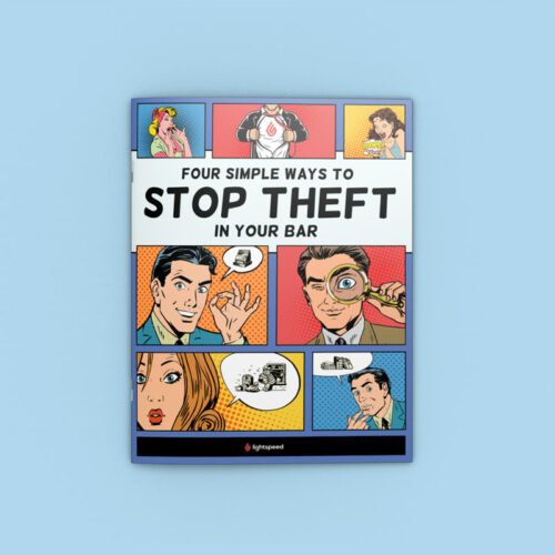
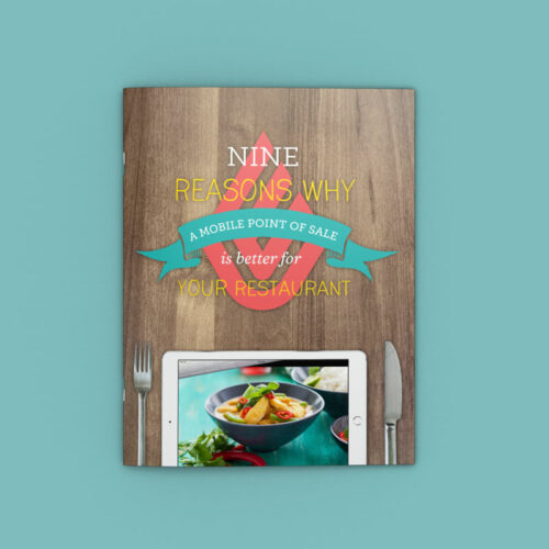
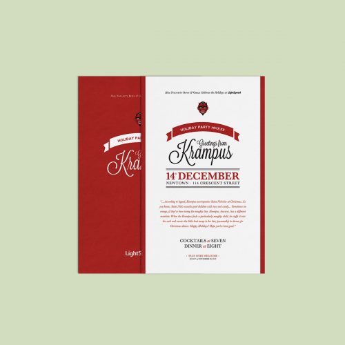
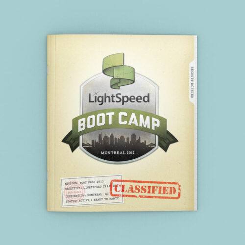
Kira is an extremely talented, detailed-oriented designer who has contributed greatly to Lightspeed's branding and communications. Her specialization is in web but also has strong talent in writing and print design. Dedicated, insightful and hard-working, Kira has been a very welcome addition to our creative team.
Dax DasilvaCEO Lightspeed
Her understanding of the project at hand, her eye for design and thorough understanding of the content that she worked with as well as her respect for critical timelines were magical attributes that brought not only products to help the community clients of the CRC but identifiable professional marketing tools. Kira's contribution to the CRC operation was key in raising our visibility. I would not hesitate to include Kira as a member of my team again, if the opportunity would be presented!
Ann DavidsonWest Island Community Resource Centre
Kira is the total package. She has an excellent work methodology, is data-driven and understands the business vision which she translates flawlessly in great user experience. She is also a great UI designer that understands her audience. She has great rationale and can easily explain her design decisions. On top of it all she has the most charming personality! I recommend her 100%.
Pascale SaraultSenior Manager, Digital Products Group Dynamite
Previous
Next
from our portfolio
similar graphic design projects