brand, identity, and logo design
The Witch of Laurel Wood
about the brand design
mystery, magic, and growth
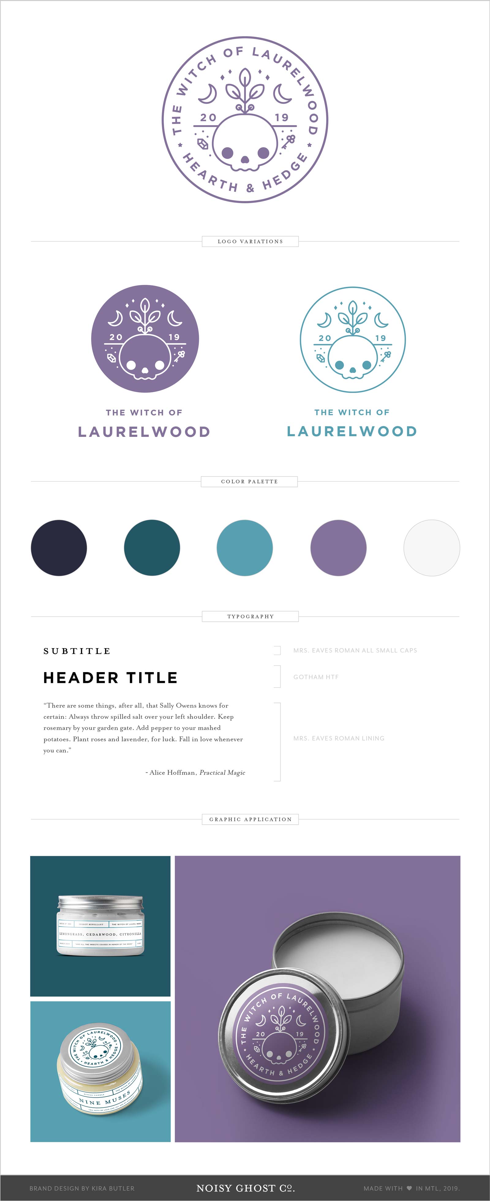
A brand designed around the concept of rebirth, magic, mystery, and darkness that nevertheless embraces its pagan roots — literally. Belonging to a kitchen witch, iconography for the brand is drawn from the hermetic aphorism, “As above, so below,” and references the elements of earth and air, and a balance between them.
A contemporary take on kitchen witchcraft required clean lines, but a throwback to the roots and bones that anchor the practice at the hearth. Products in the line include naturally-sourced candles and cosmetics, and the brand meditates on its magical roots and natural connections.
The design is inspired by the phrase “As Above, So Below,” from a passage in the Emerald Tablet (attributed to Hermes Trismegistus.) In Hermeticism, the phrase can be taken to indicate that earthly matters reflect the operation of the astral plane.
We provided a few logo and logotype variants that make use of the brand mark, and created a selection of simple, airy product labels to complement the design that could be easily updated and adapted for a variety of packaging sizes, regardless of the package contents.


