Beauty Product Packaging Design
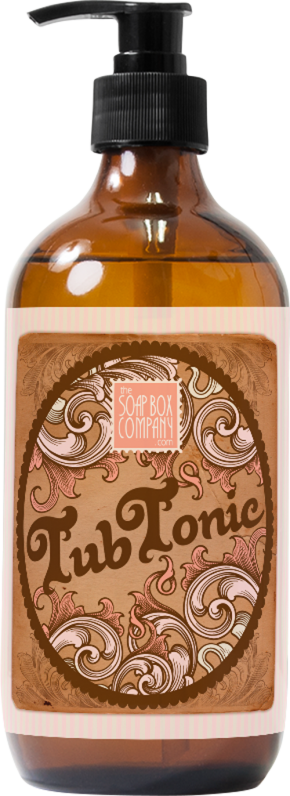
Soap Box Co. Tub Tonic
about the design
a vintage aesthetic
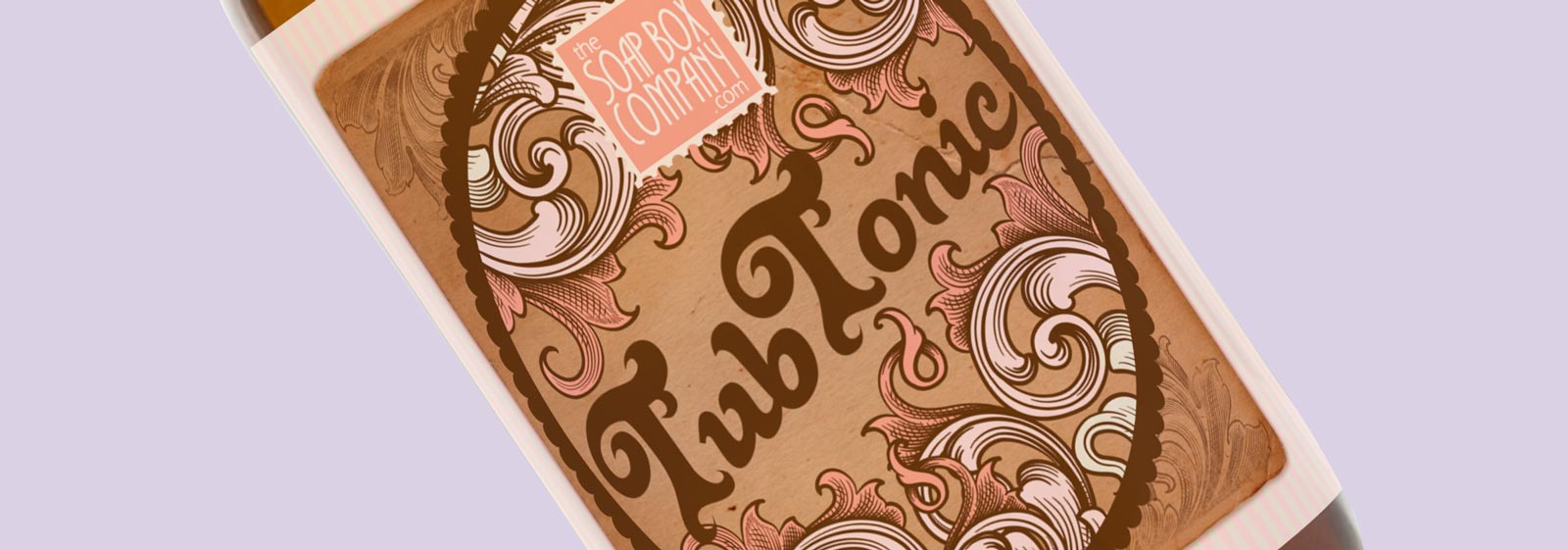
A vintage and retro-inspired look for a bath and body eCommerce shop needed to meet a few project requirements: the design needed to feel like it was reviving a classic apothecary label, but still needed to be pretty, feminine, and feel like a beauty product that fit into the Soap Box Co. brand.
- Met the brand and style requirements of Soap Box Co. using the company’s signature colors and logo
- Clearly displayed ingredients, the product description, volume, sizing, and other legal requirements for cosmetic packaging
- Used found objects and vectors to achieve a look that is both aged but clean and clearly legible
- Inspired by old-time, vintage apothecary labels and stylistic tendencies, like filigree and weathered paper, pale candy shop stripes, and delicate typography


