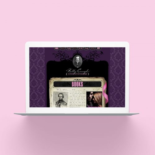
The website for young adult author, Kelly Creagh, draws inspiration from works of Edgar Allen Poe. Her “Nevermore” trilogy of books embrace Poe’s lore wholeheartedly, and it was fitting that the fantasy world inspired the site. Rich purple and nightmare black enfold the notebook pages belonging to her character, Varen Nethers, whose research about Poe’s disappearance permeates each page.
Continue readingMoonaLisa
With collection and display practices from the Enlightenment as inspiration for the website, we modelled a desktop environment around the theme of an “alchemist’s workshop”. The user looks down on an open book where the product catalogue sits surrounded by found objects, photographed from MoonaLisa’s very own collection of curiosities.
Continue readingVillainess Soaps
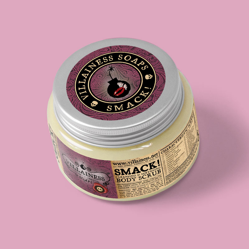
The Villainess Soaps line of products is expansive. After working together for ten years, Brooke Stant and I have amassed a collection of designs that demonstrate an expansive catalog of products, limited editions, wholesale products, and special commissions for third-party resellers. No two product labels are exactly alike. Inspired by a vintage collection of Victorian shopping catalogs, the aesthetic makes use of grainy typeset typography, luscious leather patterns, and period-specific illustrations scanned directly from vintage catalogs.
Continue readingVillainess Soaps Brand
The Villainess Soaps line of products is expansive. After working together for ten years, Brooke Stant and I have amassed a collection of designs that demonstrate an expaansive catalog of products, limited editions, wholesale products, and special commissions for third-party resellers. No two product labels are exactly alike. Inspired by a vintage collection of Victorian shopping catalogs, the aesthetic makes use of grainy typeset typography, luscious leather patterns, and period-specific illustrations scanned directly from vintage catalogs.
Continue readingJessica Verday
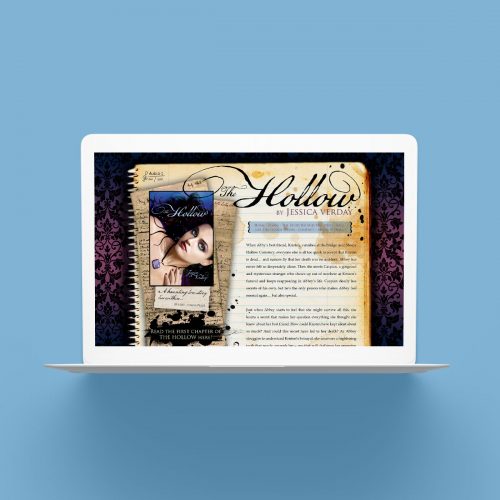
The promotional website for Jessica Verday’s debut novel, The Hollow, was designed with a young adult audience in mind. As the book trilogy has gothic undertones, we chose a layered aesthetic structured like an item owned by the protagonist of the series. A perfumer’s formulary, photographs of the novel’s settings, and even a Snickerdoodle recipe are hidden in Abbey’s “journal” website for teenage readers to discover.
Continue readingSoap Box Co. Tub Tonic
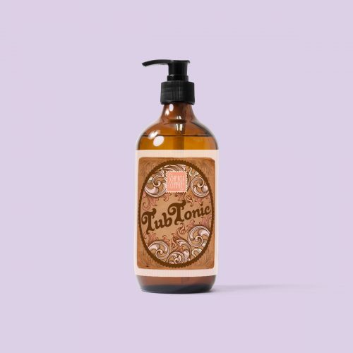
A vintage and retro-inspired look for a bath and body eCommerce shop needed to meet a few project requirements: the design needed to feel like it was reviving a classic apothecary label, but still needed to be pretty, feminine, and feel like a beauty product that fit into the Soap Box Co. brand.
Continue reading

