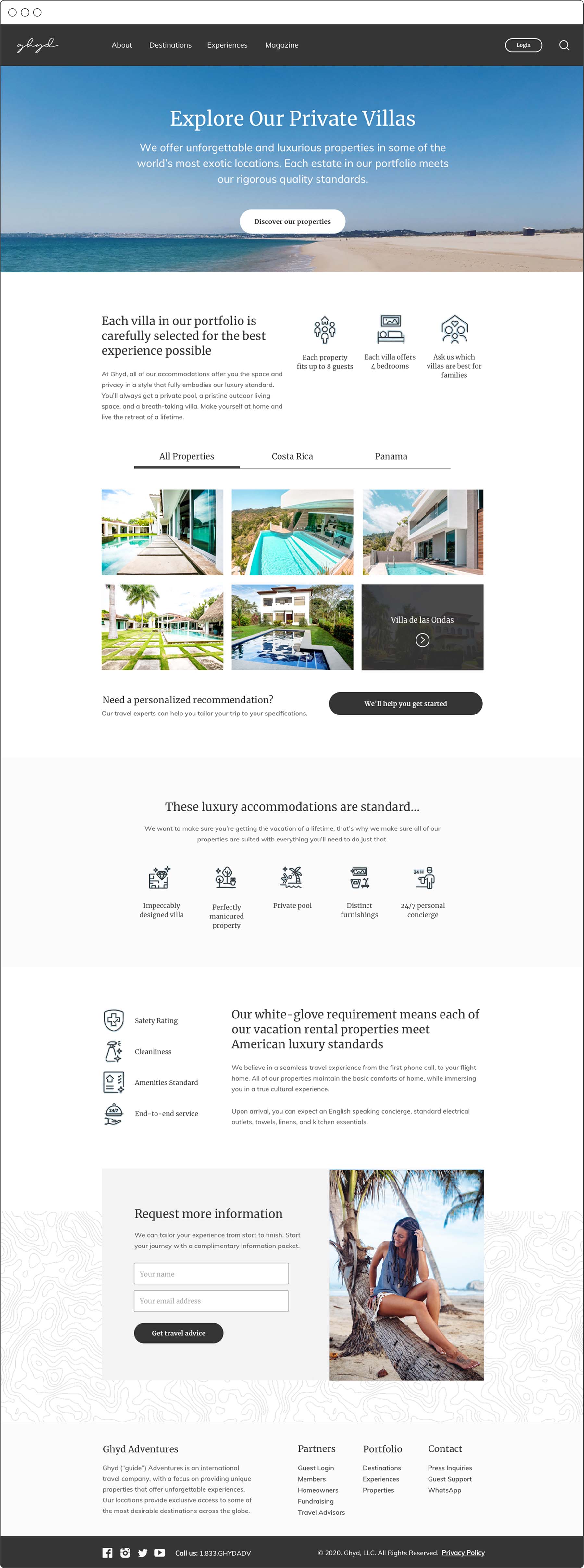
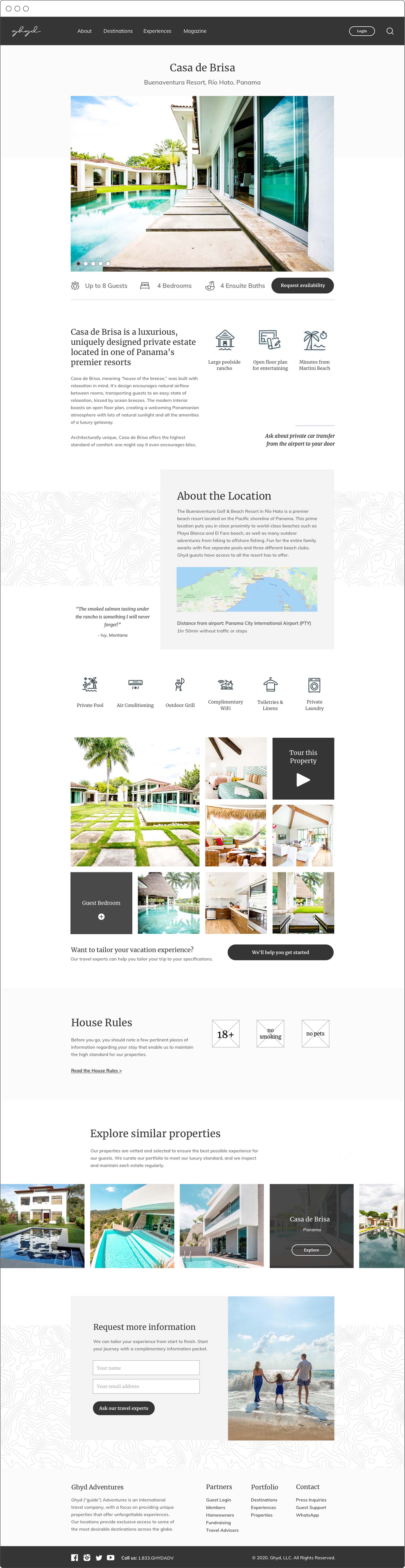
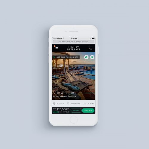
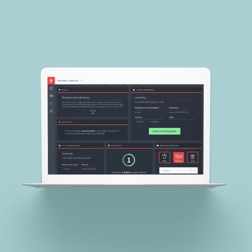
I suspect it’s been about as long since I’ve blogged as it has been since I’ve touched my portfolio website. Sometimes around the beginning of the pandemic, I eschewed most social media and shut down a couple of the sites I was running at the time — tired of talking, maybe. Maybe the pandemic was the opportunity to crawl into my cave with my projects and refocus on actually doing the work instead of discussing it. I’ve always much preferred the process, anyway — the celebratory component is altogether too short-lived and doesn’t offer the same sort of reward as the problem solving and the struggle and the small triumphs experienced privately.
Continue readingStacy Angell Curtis
The author website for Christian Romantic Suspense author, Stacy Angell Curtis, highlights her current book series and forthcoming third title, and was designed to grow with her product offering. As Stacy uses her newsletter as a primary means of communication with readers, we designed a matching newsletter to incentivize subscribers, and included a lead magnet on her site.
Continue readingTruffles & Bedlam
The Truffles & Bedlam brand embraces a creepy cute aesthetic with pastel goth colours, and indulges in the obscure, odd, and surprising. A maker of magnetic handmade bookmarks, stickers, and papercraft art inspired by fandom and pop culture, the brand design embraces a willingness to play while maintaining a tongue-in-cheek a sense of humour.
Continue readingGhyd Adventures
Martin Shannon
Martin Shannon arrived at his website design with an idea for his marketing plan — with a time table for story releases, a plan for an email marketing list, and a diligent work ethic, Martin engaged me to pull together the wrapper: a website that reflected his ties to Florida; a key setting in all of his work. We developed his content architecture collaboratively and iterated through a handful of concepts for his brand before building his WordPress site.
Continue readingThe Witch of Laurel Wood
A brand designed around the concept of rebirth, magic, mystery, and darkness that nevertheless embraces its pagan roots — literally. Belonging to a kitchen witch, iconography for the brand is drawn from the hermetic aphorism, “As above, so below,” and references the elements of earth and air, and a balance between them.
Continue readingAckerly Green Publishing
Drawn from the world building and mythology created by CJ Bernstein for his book series, we produced a number of smaller designed items for fans that could be purchased through the Ackerly Green store, and shared on the forums. Projects include tote bags, buttons, social media artwork, business cards, and a revival of the brand mascot: Herman the Hippocampus.
Continue readingAutumn Wedding Invitation
Designed for a rustic autumn wedding beneath the fall foliage, the wedding invitation for Kira Butler and Ian Frazier incorporates elements of the event’s decor: fall leaves, berries, and wood elements all set against crisp, white linen paper. Watercolor elements, brush lettering, and delicate typography sit beneath an elegant, natural arch that embrace the couples’ names.
Continue readingNoisy Ghost Co. Brand
Noisy Ghost Co. is a macabre but affectionate brand. It’s sugar skulls and ice cream, coffins and candy: a red sock accidentally mixed in with the laundry, turning its emblematic death-shroud-sheet… pink. It is the spirit of design that remains curious, inquisitive, and explorative… and occasionally levitates the furniture to get your attention.
Continue readingTooth & Bone
The Tooth & Bone brand is as much an assembly of items as the collection of oddities the blog houses. It recalls the practices of collection and display from the Enlightenment, largely because the content curated by the T&B blog is similarly themed.
Continue reading